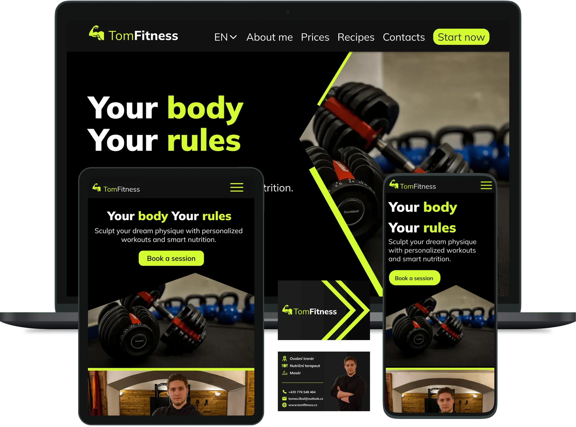
Web Design & Development for Fitness Clubs and Health Centers in Prague
Websites for the fitness and health industry in Prague require strong visual branding and seamless scheduling integrations, such as automated booking systems and membership price tables. Clean layouts for personal trainer profiles and client transformations build immediate social proof, reducing friction and converting traffic into gym visits.
Projects

To ensure complete and unbreakable brand consistency across every potential touchpoint—from digital interfaces to social media ecosystems—we meticulously developed a comprehensive suite of responsive digital banners alongside a strategically refined logo. The banner system was crafted not merely as promotional graphics, but as a scalable, modular visual language. Each set of banners is meticulously adapted for various formats and placements, from Instagram Stories and Facebook feeds to Google Display Network, ensuring flawless presentation on any device. Their design philosophy directly mirrors the website's energetic, motivational, and empowering aesthetic, utilizing a cohesive color palette, dynamic typography, and imagery that conveys transformation and vitality. This strategic alignment ensures that any user encountering a HealthMates ad experiences an instant visual connection to the core website, significantly enhancing immediate recognition, reinforcing brand memory, and systematically expanding campaign reach and effectiveness through visual coherence.
Concurrently, the logo underwent a thoughtful modernization process. The primary objective was to retain the substantial brand equity and inherent trust established with the existing audience while injecting a more contemporary, dynamic, and versatile character. The refined mark incorporates cleaner lines, a more balanced composition, and a subtle sense of motion and progression. These evolved features are designed to better visually encapsulate the essential pillars of the HealthMates methodology: proactive movement toward better health, the balance between science and simplicity, and the continuous progress achieved through regular monitoring. This updated symbol now functions more effectively across a vast array of applications, from tiny favicons and app icons to large-scale print materials.
Ultimately, this harmonized visual system—encompassing the interactive website, the dynamic ad banners, and the modernized brand mark—creates a powerful, unified brand universe. It eliminates cognitive dissonance for the customer, builds cumulative brand authority with every exposure, and ensures that whether a user interacts with HealthMates via a blog article, a social media ad, or the checkout page, they receive one consistent, trustworthy, and professionally cohesive perception. This strategic visual integrity is fundamental to converting interest into loyalty and establishing a dominant, reliable presence in the competitive digital health landscape.
Ultimately, this harmonized visual system—encompassing the interactive website, the dynamic ad banners, and the modernized brand mark—creates a powerful, unified brand universe. It eliminates cognitive dissonance for the customer, builds cumulative brand authority with every exposure, and ensures that whether a user interacts with HealthMates via a blog article, a social media ad, or the checkout page, they receive one consistent, trustworthy, and professionally cohesive perception. This strategic visual integrity is fundamental to converting interest into loyalty and establishing a dominant, reliable presence in the competitive digital health landscape.
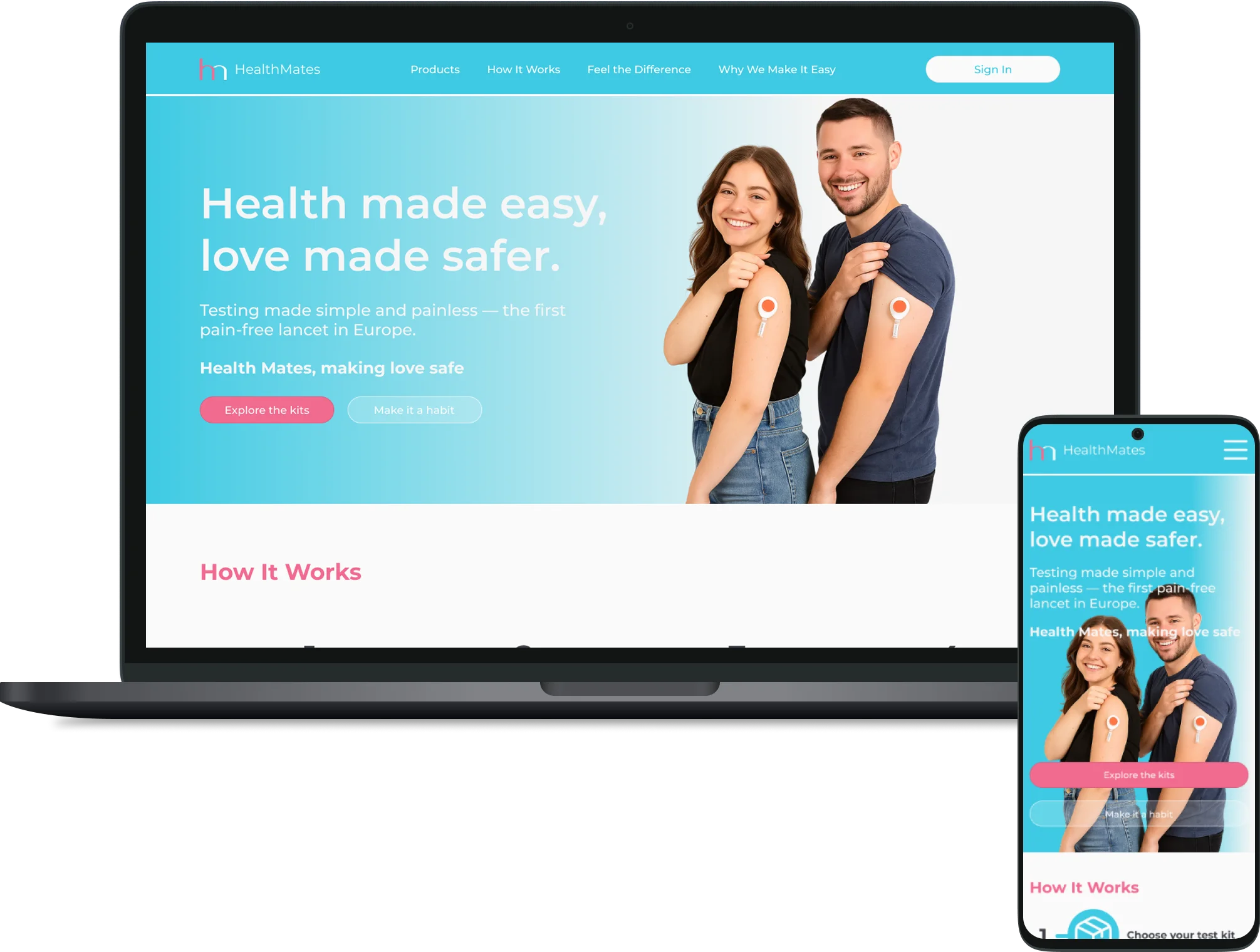
The HealthMates project was strategically centered on the seamless and sophisticated integration of a high-conversion, fully-featured e-commerce platform into the company's established, content-rich informational website dedicated to home health testing. The core challenge was to merge two distinct digital experiences—educational and transactional—into one fluid, trustworthy journey. We successfully bridged the critical gap between user education and final purchase by meticulously designing and engineering a thoughtful, intuitive, and technically robust user pathway. This involved creating a streamlined, multi-step checkout process that prioritizes clarity and reduces friction, built on the powerful and flexible WooCommerce platform and enhanced with a modern, custom frontend developed using the utility-first Tailwind CSS framework. The technical implementation ensured not only aesthetic harmony with the existing site but also rigorous performance, security for sensitive health data, and adaptability for future product or subscription model expansions.
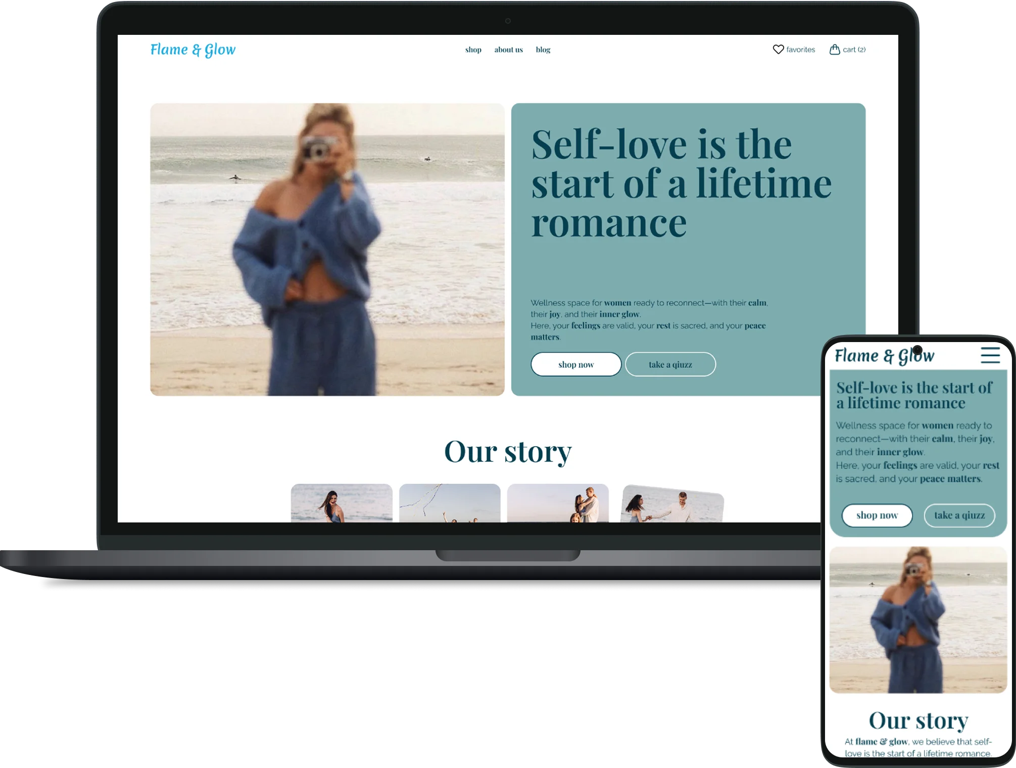

The Flame & Glow project focused on building not a standard online store but a digital sanctuary that embodies the philosophy of women's wellness — "self-love is the start of a lifetime romance." To translate this core value, we moved beyond template e-commerce solutions and designed an emotional, intuitive space centered around a personalized quiz-helper that gently guides users toward mindful ritual and product selection. Through a calming visual aesthetic, narrative-driven content, and a trust-building structure, the website became a digital extension of the brand—one that doesn't just sell, but fosters a dialogue about self-care, thereby deepening user engagement and strengthening audience loyalty.
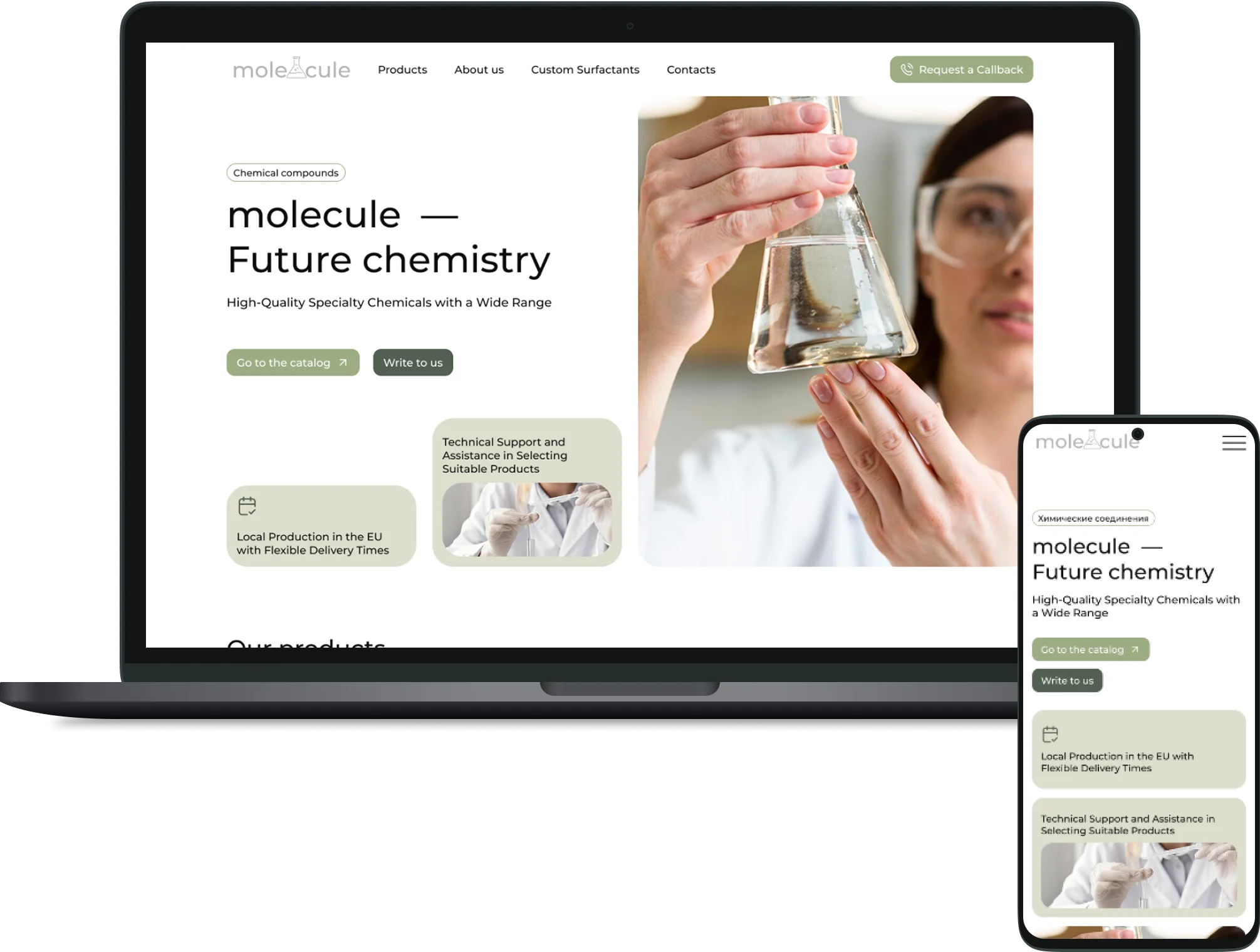

The project for Molecule aimed to transform the website from a static catalog into a strategic digital hub that builds trust in the competitive B2B specialty chemicals market. We bridged the gap between the client's real expertise (local EU production, customization) and its online perception by creating a platform with a clear conversion funnel. The site now serves three key functions: it convinces visitors of the unique value proposition, educates a complex audience, and engages them in dialogue through lead generation tools (custom solution request forms, detailed FAQ). The outcome is an increase in qualified inquiries and the strengthening of Molecule's position as a technological partner, not just a supplier.