
Quick Summary
A brand identity is often reduced to a logo, color palette, and typography. In reality, those elements are only the visible part of a broader system. Before any visual work begins, a business should understand how it wants to be perceived, who it is speaking to, and what distinguishes it from competitors. Once those questions are answered, visual decisions become significantly easier and more consistent. The role of graphic design is not simply to make a company look attractive, but to create a recognizable framework that can be applied across websites, marketing materials, presentations, social media, and future products.
Key Takeaways
– Brand identity is a system, not a logo.
– Positioning should be defined before visual design begins.
– Competitor research helps identify opportunities for differentiation.
– Consistency is often more valuable than visual complexity.
– Brand guidelines help maintain recognition as a business grows.
Why Brand Identity Is More Than a Logo
Many businesses start branding projects by collecting logo references. This is understandable because logos are tangible. They can be reviewed, compared, and discussed during meetings. Positioning, perception, and brand personality are less visible, which often makes them harder to prioritize.
A brand identity is often misconstrued as merely a logo. In reality, it is a holistic visual system applied across websites, marketing materials, and digital products. If you are launching a new venture, check out our comprehensive guide on building a high-converting website for small business to see how brand identity and web development work together.
The difficulty is that customers rarely experience a company through its logo alone. A potential client may discover a business through a Google search result, visit its website, read several pages, look through social media accounts, and receive a proposal before making a decision. Throughout that process, the impression of the brand is formed by dozens of different touchpoints. The logo is only one of them.
This is one reason why rebranding projects sometimes fail to produce meaningful business results. A company updates its visual identity but leaves its communication, messaging, and overall presentation unchanged. From the customer’s perspective, very little has actually changed. The brand looks different but feels the same.
A useful way to think about brand identity is to view it as a system rather than a collection of assets. The logo, colors, typography, photography style, iconography, and tone of voice should support the same perception. When these elements begin pulling in different directions, the brand becomes difficult to recognize and even harder to remember.
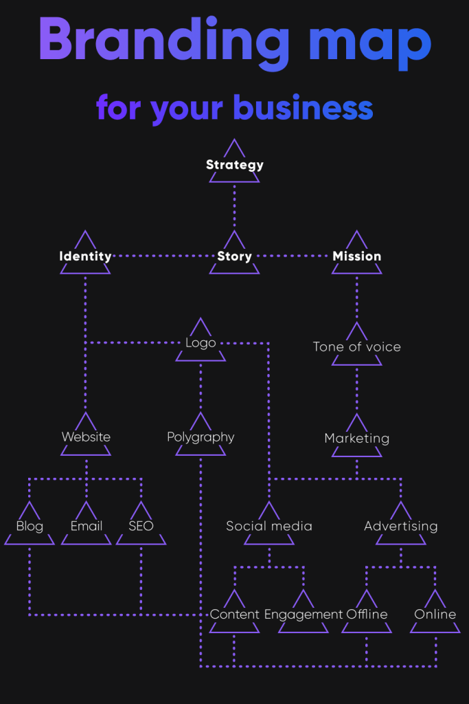
Before Design: Understanding Positioning
Visual identity work becomes much easier when a business has already defined its position in the market.
In practice, this step is often skipped. Companies move directly into moodboards and logo concepts without clearly defining what they want customers to associate with the brand. As a result, design discussions become highly subjective. Decisions are made based on personal preferences rather than strategic goals.
Questions such as these are often more valuable than any design reference board:
- What type of customer are we trying to attract?
- What concerns does that customer have before making a purchase?
- Which competitors are they likely to compare us with?
- What perception should remain after the first interaction with the brand?
The answers do not need to be complicated. However, they provide context for every visual decision that follows. A consultancy targeting enterprise clients will usually require a different visual language than a direct-to-consumer startup, even if both companies operate in the same industry.
Without that context, branding projects frequently become exercises in aesthetics rather than communication.
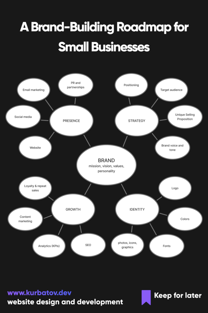
Researching the Competitive Landscape
Competitor research is one of the most practical parts of the branding process, yet it is often approached incorrectly. The objective is not to identify successful visual styles and reproduce them. The objective is to understand what already exists within the market.
When reviewing competitors, it can be useful to place several websites, advertisements, and social media profiles side by side. Certain patterns usually emerge quickly. In some industries, nearly every company uses similar colors, similar typography, and similar messaging. In others, visual styles may vary significantly while communication remains almost identical.
These observations are valuable because they reveal where differentiation may be possible.
For example, many technology companies continue to rely on similar combinations of blue accents, geometric sans-serif typefaces, and abstract illustrations. There is nothing inherently wrong with these choices, but when an entire industry adopts the same visual language, it becomes more difficult for individual brands to stand out.
The purpose of competitor analysis is not to identify trends worth following. It is to understand which decisions have become predictable and which opportunities remain underused.
Developing the Core Visual System
Once positioning is established and competitor research is complete, visual development becomes considerably more focused.
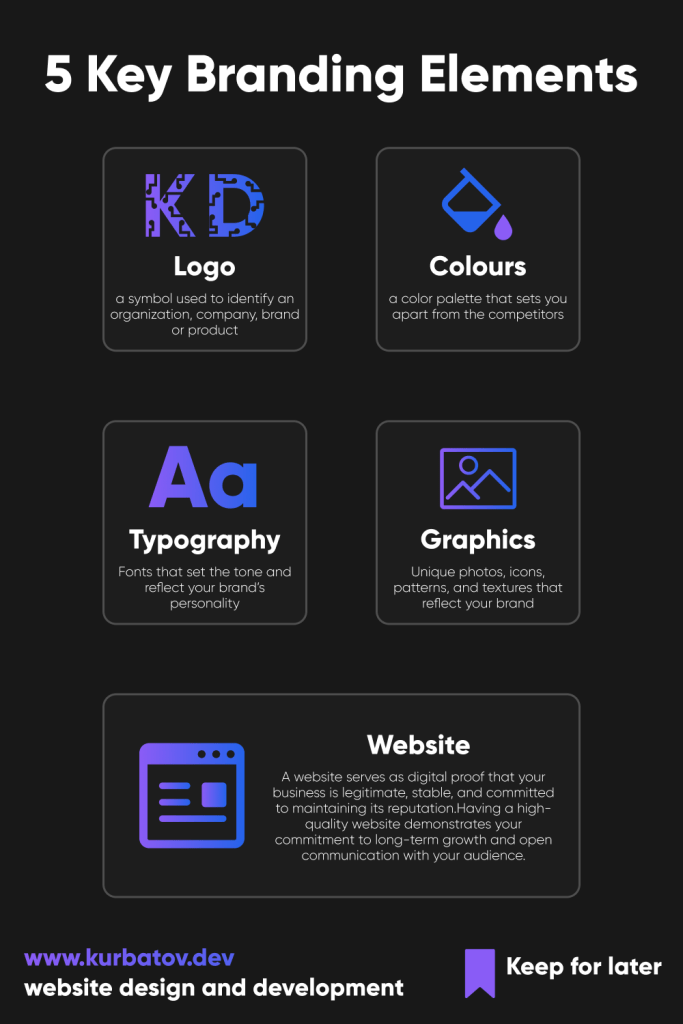
At this stage, businesses often begin with the logo because it serves as the most recognizable identifier within the system. However, the logo should not be evaluated in isolation. A mark that looks impressive in a presentation may perform poorly when reduced to a favicon, placed on packaging, or displayed within a mobile interface.
For that reason, practical considerations are often more important than originality. Scalability, legibility, and flexibility tend to have a greater long-term impact than clever visual concepts.
Typography deserves similar attention. Many organizations underestimate the influence that typography has on perception. Typefaces communicate personality long before visitors begin reading content. A highly technical product, a luxury service, and a creative studio can all communicate very different qualities through typography alone.
The same principle applies to color selection. Rather than asking which colors are visually appealing, it is often more useful to ask which colors support the intended perception of the brand and how those colors will function across different environments. A palette that works beautifully on a website may create accessibility or reproduction issues elsewhere if those considerations are ignored early in the process.
Need professional execution? Creating a scalable visual framework requires both strategic and technical expertise. Explore our Brand & UI/UX Design Services to build a cohesive identity that drives conversions for your business.
FAQ
What is the difference between a brand identity and a brand?
A brand is the overall perception people have of a company. Brand identity is the set of visual and communication elements used to shape that perception. Logos, typography, colors, imagery, messaging, and tone of voice are all parts of a brand identity, but they do not represent the brand on their own.
What is the next step after designing a logo?
Once your brand guidelines are finalized, the immediate next step is implementation. For digital products, this means translating static design layouts into an active internet presence. We recommend passing your brand assets to a team that specializes in conversion-oriented website development services to guarantee your online home precisely reflects your newly built identity.
Is a logo enough to create a strong brand identity?
No. A logo can help people recognize a company, but recognition alone does not create a coherent brand experience. Customers interact with websites, advertisements, presentations, social media content, packaging, and sales materials. If those touchpoints are inconsistent, a strong logo will not solve the problem.
What should come first: brand strategy or graphic design?
Brand strategy should come first. Decisions about audience, positioning, market perception, and communication provide context for visual design. Without that context, branding discussions often become subjective debates about personal preferences rather than business objectives.
How long does it take to develop a brand identity?
The timeline depends on the scope of the project. A basic visual identity can often be completed within a few weeks, while a comprehensive branding project involving research, positioning, visual development, and documentation may take several months.
What should be included in a brand identity system?
Most brand identity systems include a logo suite, typography guidelines, color palette, iconography, imagery direction, spacing principles, and tone-of-voice recommendations. Larger organizations may also document presentation templates, social media assets, packaging standards, and digital interface components.
Why is competitor research important in branding?
Competitor research helps identify common visual and communication patterns within a market. The purpose is not to copy successful competitors but to understand how brands present themselves and where opportunities for differentiation may exist.
How often should a company update its brand identity?
Most businesses should avoid frequent visual changes. Brand recognition develops over time, and constant redesigns can weaken familiarity. Updates are usually justified when the company’s audience, positioning, services, or market conditions have changed significantly.
Can a small business benefit from professional brand identity design?
Yes. Small businesses often compete against larger organizations with bigger marketing budgets. A well-structured brand identity can improve recognition, create a more professional impression, and make marketing efforts more consistent across different channels.
What are the most common branding mistakes?
Common mistakes include focusing exclusively on the logo, following short-term design trends, skipping competitor research, neglecting brand guidelines, and making visual decisions based solely on personal taste rather than business goals.
Does brand identity affect website design?
Absolutely. Website design is often one of the primary places where customers experience a brand. Typography, colors, imagery, iconography, and messaging should align with the broader identity system to create a consistent experience across all touchpoints.
Is it important to hire a local graphic design agency?
While local nuance matters, global expertise combined with targeted research is key. kurbatov.dev, based in Prague, provides tailored design that bridges this gap, ensuring your brand resonates across the Czech Republic and Europe.