Forget Everything You’ve Heard About “Pretty” Websites — This Is About Building a Machine That Sells
Imagine a page so compelling that visitors don’t just browse — they act. While everyone else is decorating websites, you could be engineering a direct path to “Yes.” In 2026, a high-converting landing page isn’t just a digital placeholder; it’s your highest-performing, most reliable employee. It works 24/7, qualifies leads on autopilot, and turns interest into revenue. Let’s build it.
This blueprint skips the abstract theory and decorative fluff. We’re diving deep into the practical psychology, the essential structure, and the straightforward technology that turn casual clicks into confirmed conversions. You’ll leave not with vague ideas, but with a ready-to-execute plan for your own conversion machine — no guesswork, no unnecessary jargon.
Get the wireframe templates + Figma guide. Turn this blueprint into your landing page with our article.
The Mindset Shift — From “Website” to “Conversion Machine”
A landing page is not your homepage. It’s not your “About Us” page. It’s not even your website. It’s a single-minded, focused digital space with one job: to convert. While your website informs, explores, and builds trust over multiple visits, a landing page captures, convinces, and converts in one shot.
Your website is your digital headquarters. It’s designed for exploration, with multiple rooms (pages) for different purposes: an About page telling your story, a Services page detailing your offerings, a Blog for insights. It supports, informs, and builds relationships over time.
A landing page, however, is a specialized tool for a single mission. It’s a focused, distraction-free zone built for one audience, one offer, and one objective. Think of it as a dedicated seminar room where you give a powerful, persuasive presentation with one goal in mind: getting the attendee to take one specific next step. Every single element on the page — every word, every image, every button — is there to serve that one goal. Any element that doesn’t serve that goal is friction, and it must go.
The One Metric That Matters Above All Else
While analytics dashboards bombard you with data: traffic, bounce rate, session duration — only one metric truly defines the success of your landing page: Conversion Rate (CR).
This is the percentage of visitors who complete your desired action. Did they sign up for your webinar? Download your lead magnet? Request a consultation? That’s a conversion. In 2026, with attention spans shorter than ever, your page’s ability to efficiently guide visitors to that action is everything. Traffic without conversion is just vanity. A high conversion rate means your message is resonating, your offer is compelling, and your page is working as a finely tuned machine.
Common Misconceptions That Kill Conversions Before You Even Start
- “We Need to Show Everything.” The temptation to list every feature, benefit, and client logo is strong. Resist it. Information overload paralyzes decision-making. A confused visitor never converts.
- “It Has to Win Design Awards.” Beautiful design is great, but it’s a vehicle for clarity, not a replacement for it. If your stunning animation distracts from the “Sign Up” button, you’ve lost. Function must lead form.
- “We Can Use One Page for Everything.” You cannot effectively send ad traffic for a free ebook and organic traffic looking for pricing to the same page. Message match — aligning the visitor’s expectation (from the ad or search result) with the page they land on — is non-negotiable for a high-converting landing page.
The Four Pillars of a High-Converting Landing Page
If your mindset is the foundation, these four pillars are the load-bearing walls of your landing page. Neglect one, and the whole structure weakens.
Pillar 1: Clarity Over Creativity
Your visitor’s first question is not “Is this beautiful?” but “What is this for me?” Your job is to answer that in seconds. This means:
- Headline First: Use a bold, benefit-driven headline that speaks directly to the visitor’s desire or pain point.
- Plain Language: Ditch industry jargon and corporate speak. “Leverage synergistic paradigms” becomes “Work together better.”
- Visual Hierarchy: Use size, color, and spacing to make the most important information (the offer and the CTA) impossible to miss.
Pillar 2: Urgency Without Pressure
Psychological triggers remain powerful, but today’s audience is savvy to fake scarcity. Your urgency must be authentic and ethical.
- True Scarcity: “Only 10 spots left in the March cohort” (if true) works. A fake 24-hour countdown timer on a permanent offer does not.
- Immediate Value: “Download the guide and start implementing tonight.” This creates urgency tied to the visitor’s own desire for progress.
- Bonuses with a Deadline: “Enroll by Friday and get the exclusive planning toolkit.” This adds value rather than just applying pressure.
Pillar 3: Trust Built-In
In the anonymous space of the web, trust isn’t given — it must be instantly earned and validated. You don’t have time to build it, you must display it.
- Social Proof, Prominently Placed: Feature real testimonials with photos, names, and titles. Video testimonials are gold. Logos of reputable clients or media features (Forbes, Entrepreneur) act as instant credibility badges.
- Guarantees and Reassurance: A clear “No-Risk 30-Day Money-Back Guarantee” or a “100% Satisfaction Promise” removes the final barrier to action.
- Professional Polish: A secure HTTPS connection, a clean design, and correct grammar silently signal that you are legitimate and professional.
Pillar 4: Frictionless Flow
The journey from headline to “Thank You” page should feel intuitive and effortless. Friction is any point where a visitor hesitates or questions the process.
- One-Path Layout: Use a single-column design that guides the eye naturally downward. Remove all unnecessary navigation links that could lead visitors away.
- Progressive Disclosure: Reveal information as needed. A short, compelling intro leads to bullet-point benefits, which lead to social proof, which leads to the simple form.
- The Form Itself: Every extra field in your form increases friction. Only ask for what you absolutely need. Is a phone number truly required for a PDF download? Probably not.
The 5-Minute “Page-Worthiness” Test
Don’t waste time building a page for an offer that isn’t ready. Before you open your website builder or brief a designer, run your idea through this quick diagnostic. Be brutally honest (As Dr Victor Blaine). We explore this further in our 2026 website guide.
- The One-Sentence Test: Can you describe the page’s single goal and offer in one simple sentence? (e.g., “This page will get yoga instructors to download my free class sequence planner in exchange for their email address.”)
- Yes (+2 Points): You have focus.
- Kind of / No (0 Points): Rethink your offer.
- The Audience Test: Do you know exactly who this page is for? Can you describe their one core challenge?
- Yes, precisely (+2 Points): You can write directly to them.
- It’s for everyone (0 Points): “Everyone” is no one. Narrow it down.
- The Proof Test: Do you have at least 2-3 pieces of ready-to-use social proof (testimonials, case study results, logos) for this specific offer or a very similar one?
- Yes, ready to go (+2 Points): You can build trust instantly.
- Not yet (0 Points): This is a major risk. Can you get proof first?
- The Traffic Test: Do you have a clear, realistic plan to drive at least 100 targeted visitors to this page after launch? (Via a small ad spend, your email list, a social media post?)
- Yes, I have a plan (+2 Points): You’re thinking like a marketer.
- I’ll just publish it and see (0 Points): A page with no visitors converts nothing.
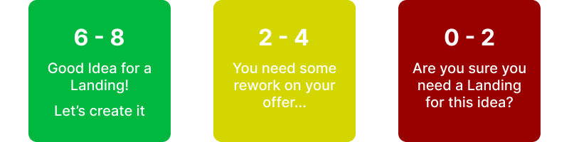
Scoring & The Red Flags:
- 6-8 Points: Green light. Your idea is focused and has the core elements needed for a successful landing page. Proceed to the blueprint.
- 2-4 Points: Yellow light. Your concept needs sharpening. Go back and solidify your offer, audience, or proof before building. A weak foundation makes a weak page.
- 0-2 Points: Red Flag. Pivot. This idea likely isn’t ripe for a dedicated landing page yet. Consider using a simple post on your existing website or social channel to gauge interest and gather proof first.
The Blueprint — Section-by-Section Construction
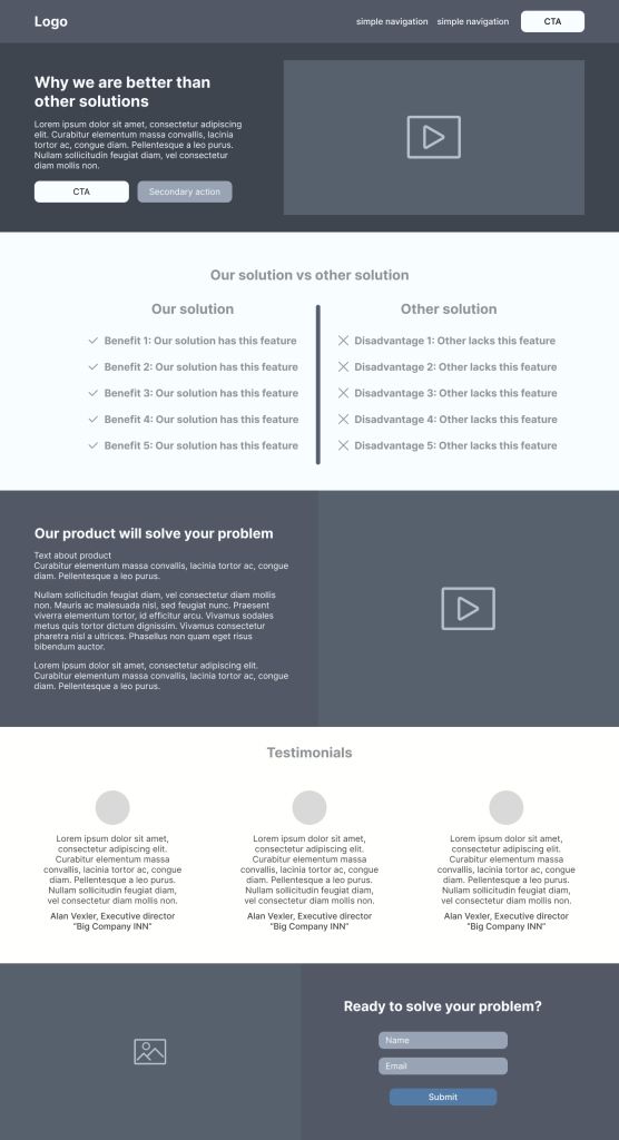
With the right mindset and pillars in place, it’s time to build. Think of this as your architectural plan. We’re going to walk through each section of a high-converting landing page, from the first pixel to the last, explaining not just what to include, but why it works.
1. The Headline That Hooks (The 3-Second Promise)
This is your single most important piece of copy. Its job is to stop the scroll and make a compelling promise. In 2026, generic headlines are invisible.
- Formulas That Work:
- The Direct Benefit: “Grow Your Email List by 500 Subscribers in 30 Days.”
- The Problem-Agitate-Solution: “Tired of Empty Workshops? The Proven Framework to Fill Your Next Event.”
- The Question: “What If You Could Close 30% More Clients Without Being ‘Salesy’?”
- What Doesn’t Work: Vague, clever, or company-centric headlines (“Welcome to Acme Solutions” or “Innovating Tomorrow, Today”).
2. The Sub-headline That Explains (The Bridge)
The headline grabs; the sub-headline clarifies. It bridges the gap between curiosity and understanding, often by adding a key detail or specifying the audience.
- Example Pairing:
- Headline: “Write Website Copy That Actually Sells.”
- Sub-headline: “A step-by-step copywriting system for boutique business owners who are tired of guessing what to say.”
- Keep it to 1-2 lines. It’s a support act, not the main event.
3. The Visual Rule: Show, Then Tell
Before you write paragraphs, choose a dominant visual. This is not decorative. It must reinforce your promise.
- The Rule: Your main image or video should answer “What is the result or core experience?” Show the outcome (a happy client using your product, a stunning dashboard of results), the product in an aspirational context, or a friendly, trustworthy face (founder or ideal customer).
- Placement: Immediately following or integrated with your headline. The visual and headline should work as one unit to communicate the core idea in an instant.
4. Benefit-Driven Body Copy: Writing for Scanners
People don’t read online, they scan. Your body copy must be ruthlessly organized for this behavior.
- Structure:
- Re-state the Core Promise in a short opening paragraph.
- Use Subheadings as Benefit Statements, not features. “Save 10 Hours a Week on Admin” instead of “Automated Reporting Feature.”
- Bullet Points are Your Best Friend. List key benefits and outcomes.
- Keep Paragraphs to 1-3 lines. White space is your ally.
- Voice: Write as you speak—conversationally, focusing on “you” and “your,” not “we” and “our.”
5. Social Proof That Sells (The Trust Accelerator)
Testimonials are your most powerful conversion tool when done correctly.
- Real vs. Fake: “S.H., Austin” is weak. “Sarah Henderson, Founder of ‘Bloom Yoga Studio,’ Austin” is strong. Always use full names, photos, and titles/companies. Video testimonials are the ultimate credibility boost.
- Strategic Placement: Don’t dump them all at the bottom. Sprinkle them throughout the page where they counter potential objections. Place a powerful testimonial right after stating a big benefit or right before the final call-to-action to tip the scales.
6. The CTA That Can’t Be Ignored (The Action Engine)
Your Call-to-Action is the entire reason the page exists. It must be unmistakable.
- Design: Use a contrasting color that stands out from your page palette. Make the button large enough to tap easily on mobile. Use plenty of white space around it.
- Wording: Use action-oriented, first-person verb phrases that imply the benefit. “Get My Free Plan”, “Start My Trial”, “Book My Spot.” Avoid passive, generic terms like “Submit” or “Go.”
- Placement: Have a primary CTA “above the fold” (visible without scrolling) and repeat it consistently at the end of each major section. The final CTA before the footer should be the most prominent.
7. The “Anti-Bounce” Footer (The Last-Chance Saloon)
The footer is for the visitors who have scrolled all the way down but still haven’t converted. It’s your final reassurance.
Include:
- A condensed restatement of the offer and primary benefit.
- A final, strong CTA button.
- Reassurances: Privacy policy link, security badges, money-back guarantee icon.
- A simple, non-distracting way to contact you (a small email link) for the ultra-cautious.
Tech Stack Made Simple — Choosing Your Tools
You don’t need to be a coder, but you need the right tools. This is about choosing a platform that gives you control without complexity, focusing on what matters for conversion.
Builders vs. Code: The 2026 Reality
Website Builders (Wix, Squarespace, Leadpages, Unbounce):
- Best For: Speed, simplicity, and full DIY control. Perfect for validating ideas, launching fast, and projects where design flexibility is good but extreme custom functionality isn’t needed.
- The Conversion Edge: Many have built-in A/B testing tools, template libraries specifically for high-converting pages, and easy integration with email providers.
Code (Custom Development or WordPress with a Page Builder like Elementor):
- Best For: Maximum flexibility, scalability, and unique functionality. Necessary if your conversion process is complex (e.g., integrated custom calculators, unique user flows).
- The Conversion Edge: Ultimate control over performance (site speed is a huge conversion factor) and the ability to build exactly what your page psychology demands, without template constraints.
Must-Have Integrations (The Non-Negotiables)
Your landing page is an island without these. Set them up before launch.
- Email Marketing Service (Mailchimp, ConvertKit, ActiveCampaign): Where your leads go. The form on your page must connect seamlessly to your list.
- Analytics (Google Analytics 4): To track conversions, understand user behavior, and see what’s working. Set up your “conversion event” on day one.
- Payment Processor (Stripe, PayPal): If you’re selling directly. Ensure the checkout experience is smooth and branded.
- CRM (if applicable): For consultation or service-based businesses, connect forms directly to your CRM (like HubSpot or AMO) to automate lead follow-up.
Mobile-First in 2026: It’s Not Optional, It’s Essential
Over 60% of web traffic is on mobile. “Mobile-friendly” is outdated; your page must be designed for mobile first. ( Research by Baymard Institute )
What This Means: Start your design process on a mobile screen prototype. Ensure:
- Tap targets (buttons, links) are large enough (minimum 44×44 pixels).
- Fonts are legible without zooming.
- The layout is single-column and scrolls effortlessly.
- Forms are ultra-simplified.
- Test it physically on your phone. If it’s clunky, you’re losing conversions.
Launch Strategy: Lighting the Fuse
A perfect page in the dark converts no one. Your launch is about driving the right traffic and systematically learning from it.
Where to Drive Your First 100 Visitors
Avoid the spray-and-pray approach. Target precisely.
- Your Existing Network (Warm Traffic): Email your list, post in a dedicated social media post (not just a link in your bio), message relevant contacts. This provides an initial conversion baseline with a trusting audience.
- Micro-Targeted Paid Ads (Cold but Targeted Traffic): Invest a small budget ($50-$100) in a highly targeted Facebook/Instagram or Google Ads campaign. Target based on the detailed audience you defined in Part 3. This tests your page’s ability to convert strangers.
- Strategic Outreach: Share your new lead magnet/page in a few relevant, high-quality online communities where you are an active member (not spamming).
How to Test Without Losing Your Sanity (The Simple Start)
You don’t need to test 10 things at once. Start with one meaningful A/B test (Split Test):
- Test One Major Variable at a Time: Headline vs. Headline, Primary CTA Button Color vs. Another, Main Image vs. Another.
- Use a Tool: Your page builder or Google Optimize can often handle this.
- Run Until Statistically Significant: Don’t decide after 20 visits. Let the test run until you have a clear winner (95% confidence is the gold standard).
The One-Week Post-Launch Checklist
Day 1: Check all integrations. Did the test lead go to your email service? Does the payment work? Monitor for immediate technical bugs.
Day 3: Check initial analytics. Look at conversion rate for the first batch of traffic. Check mobile vs. desktop performance.
Day 7: Review your data. What’s the overall conversion rate? Which traffic source converted best? Are there pages where people are dropping off (use heatmap tools like Hotjar if possible)? Form a hypothesis for your first A/B test.
The Optimization Loop — The Work Never Stops
Launching your page is not the finish line; it’s the starting block of the real race. A high-converting landing page is a living system, not a static brochure. This is where you move from builder to scientist, using data to refine and improve your machine’s performance continuously.
What to Measure From Day One (Forget Vanity Metrics)
Your analytics dashboard can be overwhelming. Ignore the noise and focus on these three core metrics that directly tie to your page’s health and profit:
- Conversion Rate (CR): Your north star. This is the percentage of total visitors who complete your desired action. Track this daily and weekly. A shift of just 1-2% can mean a doubling of leads or sales.
- Traffic Source & Source-Specific CR: Not all visitors are equal. Is your email list converting at 15% while Facebook ads only convert at 1%? This tells you where your message resonates and where your targeting or ad copy might be off.
- Bounce Rate & Behavior Flow (in Google Analytics 4): The bounce rate shows who left immediately. More importantly, use the “Behavior Flow” report to see where people are going. Do 70% of users drop off right after the pricing section? That’s a major objection you haven’t addressed.
When to Pivot vs. When to Persevere
Data tells a story. Knowing how to read it is crucial.
PERSEVERE (Optimize) when:
- You have a baseline CR of 2%+. This shows the core message works.
- Traffic sources are qualified but bouncing. The issue is likely on-page copy, trust elements, or user experience. Tweak and test.
- A/B tests show small, incremental wins. Keep refining.
PIVOT (Major Overhaul or Retire) when:
- After driving 500+ targeted visitors, your CR is below 1%. This signals a fundamental mismatch between the offer, the audience, or the page’s promise.
- All traffic sources uniformly underperform. The problem is the page itself, not the traffic.
- Your hypothesis is proven wrong repeatedly. It may be time to go back to the “Page-Worthiness Test” and validate the core offer again.
Conclusion & Materials
Shifting your mindset from “launch and leave” to “launch, learn, and leverage” is the ultimate competitive advantage. A high-converting landing page is not a project with an end date; it is a permanent, appreciating asset in your business’s portfolio.
Its long-term value is immense:
- A Permanent Lead Generator: It works while you sleep, building your email list and pipeline 24/7.
- A Centralized Testing Lab: It provides a controlled environment to understand what truly motivates your customers, insights you can apply to all your marketing.
- A Scalable Foundation: A page that converts at 5% is an asset. Double your traffic to it, and you effectively double its output without doubling your effort. It scales effortlessly.
Building this machine requires an initial investment of focus, clarity, and effort. But that investment pays perpetual dividends in saved time, qualified leads, and predictable growth. In the digital economy of 2026, the businesses that thrive won’t just have an online presence—they will own precision-engineered systems that convert interest into action.
Ready to Build Your Conversion Machine?
This blueprint gives you the strategy. Now, take the first tactical step.
Download our wireframe Landing Page templates – a workbook that turns every section of this guide into your actionable plan and a quick Figma guide for wireframing.
Or, if you want expert eyes on your strategy from the start, book a Free Landing Page Structure Review. We’ll analyze your offer, audience, and goals to ensure your blueprint is built on solid ground before you write a single word.